I’m a little late on this, but I finally took the time to put a new theme together. Here are some of the highlights.
In this post:
A look back
After two and a half years of the spartan, utilitarian look, I decided it was time to freshen up the place a bit. That original theme was not without its purpose—consuming content on the web can be exhausting, so I wanted a place where I could provide content free from all the shackles of modern web presentation. I didn’t use any analytics (still don’t), the colors I did use were slight tweaks on the browser defaults, and the font stack was whatever your operating system gave you.
As much as I did quite like the minimalist approach, it started to feel like I was sending the wrong signals. I consider myself a designer, after all, so shouldn’t my site have at least some personality?
Starting over
I started my little redesign by scouring the web for inspiration. There are certainly lots of hot 🔥 trends these days, but I still wanted to keep things on the more low-key side.
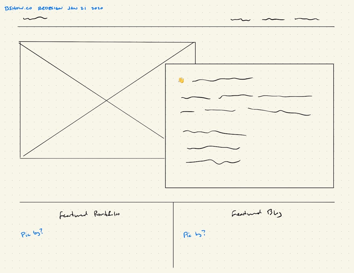
The home page is the obvious choice for injecting a little bit of flair. I took to Goodnotes on my iPad and started sketching up some ideas. The above wireframe is what I finally settled on—a layered intro section with a picture and a text blurb, then two massive links to featured portfolio and blog items.
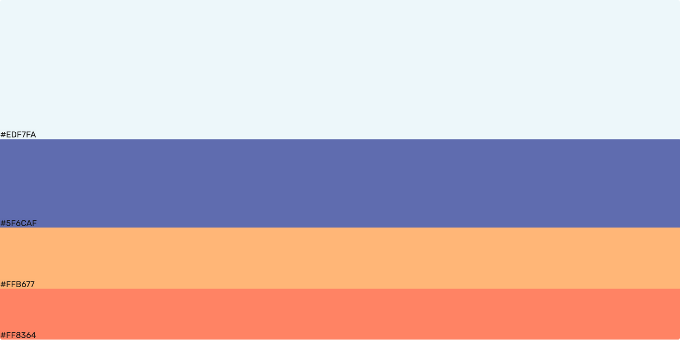
With a goal in mind, I hopped over to CodePen to get a feel for how this design could work. I also grabbed a color scheme from Color Hunt.
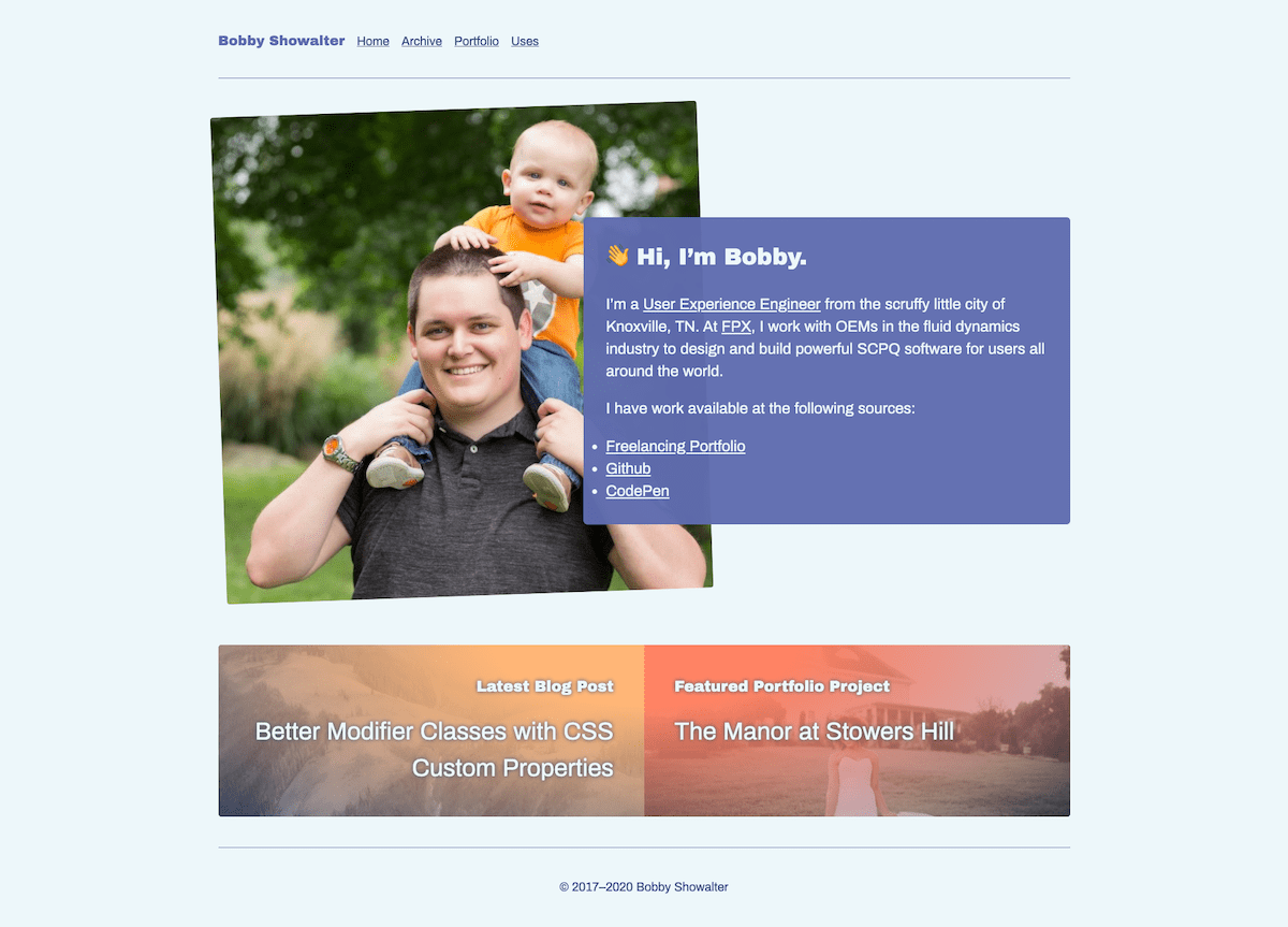
Getting into code made it simple to start experimenting with the color and layout beyond what my simple sketch could have done. I rotated my headshot picture a bit and added some gradients to the featured content links.
Personality! 😎
More than just a pretty face
With the home page in place, it was time to tackle…well, everything else.
I quite like a “featured image” on a blog post when it’s done well. Trouble is, coming up with an appropriate image for every post is an extra chore that I’m just not interested in. Luckily, neat services like Unsplash exist. I had read that the Birmingham Museums Trust uploaded a large collection of their watercolour paintings for use, so I wired up my post headers to pull a random image from their collection at every page load. That way every post gets a pleasing picture without having to spend any time thinking about it. I may come back at some point and enhance the post layout by allowing for a defined featured image, but this works great for now.
The typography received a great deal of attention as well. I’m still using the
same 70ch-wide body text column as before, but now it is set within a larger
page grid that allows for much more creativity. I pulled the list punctuation
out into the left margin (except on smaller views where it could get lost against
the edge of the browser), bumped up the base font-size, and even opted for a
new typeface duo of Archivo and
Archivo Black.
That’s all…for now
I think that about takes care of the important updates. It took over a dozen commits to get here, but I’m pleased with the result and have enjoyed working with this new look as I continue to make content updates.
Is it finished? Gosh, no. I have some cleanup to do to make the page and post styles a little DRY-er. Dark themes are just about expected these days, so I need to figure that out as well. But I’ll get there eventually, perhaps on a day where I need a mental break or spark of joy from more stressful situations. That’s what makes this such a great worry stone.