In 2019, Revalize launched an initiative to consolidate multiple legacy and modern products focused on Projects, Quotes, and Orders into a single application. Part of this effort involved redesigning the differing Details views with a new, standard UI.
In this post:
In the beginning
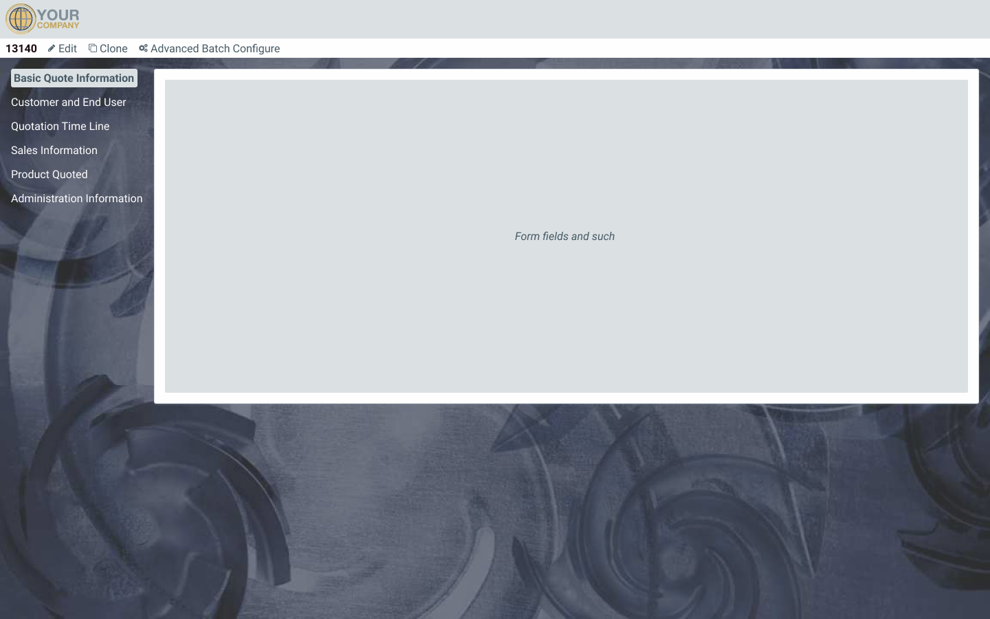
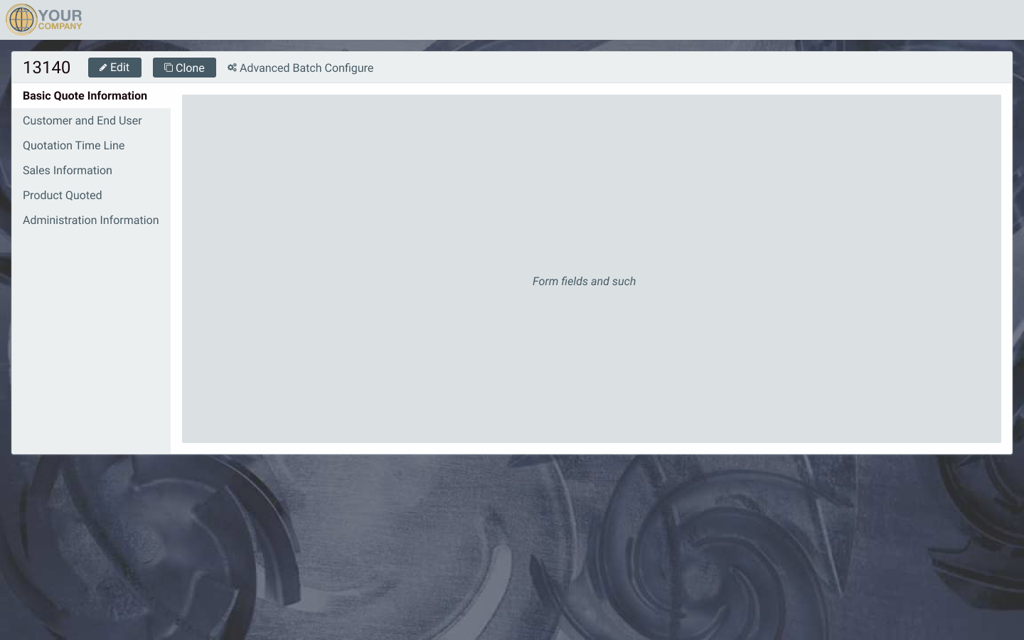
Quote Manager
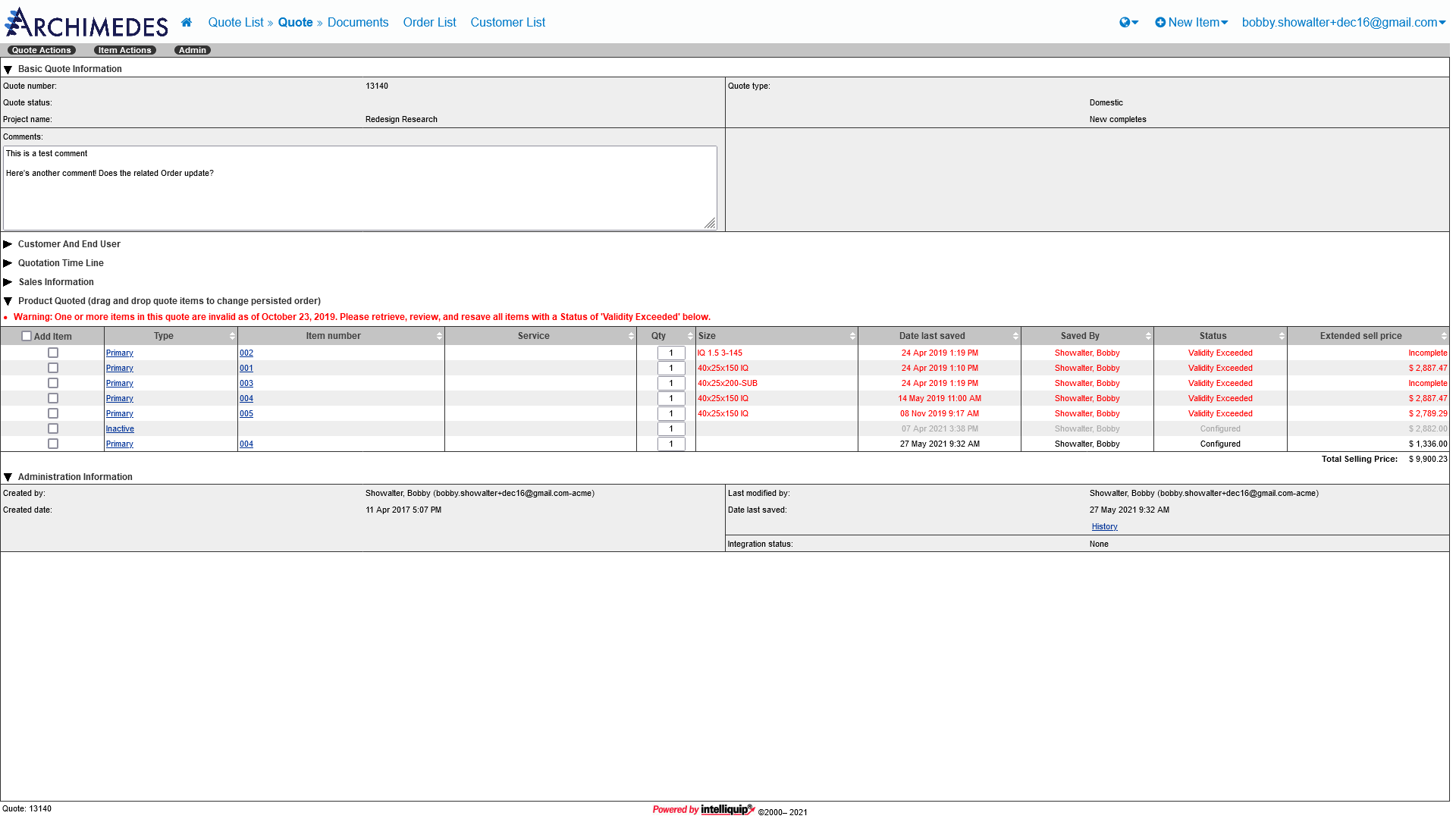
The Quote Manager is one of our legacy applications, dating back to the earliest days of the company. This application features a table-heavy layout and ancient HTML/CSS conventions. Although a user of our applications may also need to work with Projects and Orders, QM only deals with Quotes.
Project Portal
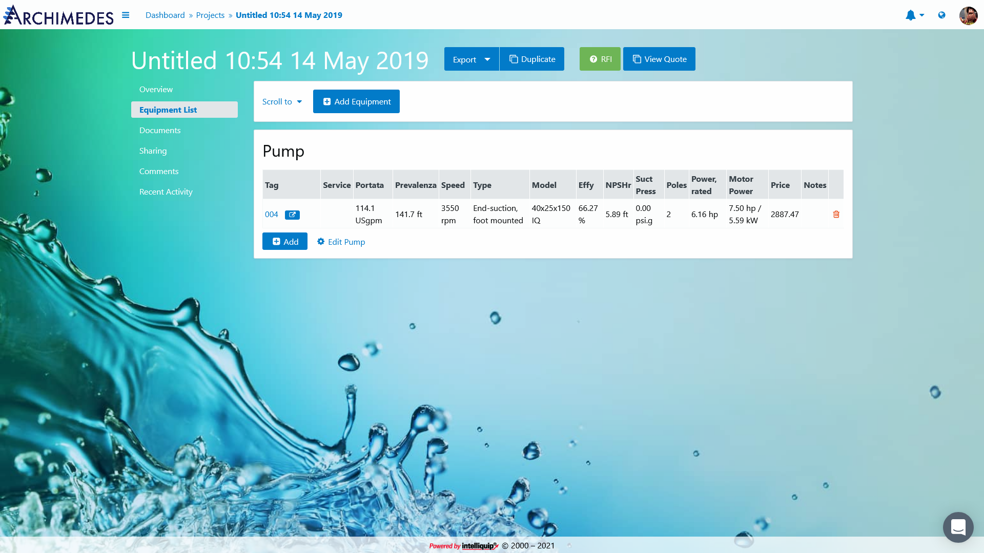
Project Portal is a modern application, launched not long after I joined Revalize in 2015. This application features a more up-to-date interface with a simpler user experience. Like the name implies, Project Portal is all about Projects. Quotes or Orders must be managed elsewhere.
Research and planning
To begin my research, I took note of any questions or observations I had while reviewing the Details pages. Not every item would come back up later, but it was useful to capture my impressions to help guide future brainstorming sessions, or to help explain the rationale behind a particular design choice. I did have a guiding hand in the previous design of the Project Portal Details view, so I focused most of my energy on the Quote Manager page since it was more unfamiliar to me.
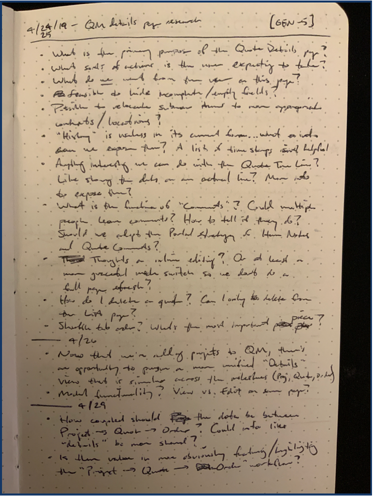
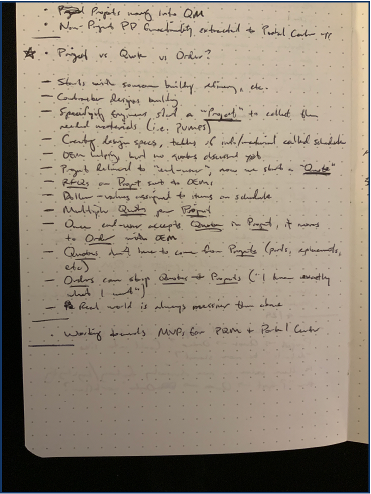
Early in the research process, I sought more information about the differences between Projects, Quotes, and Orders, and how the three might be related. Understanding their relationship would help surface any areas where we could leverage consistency and predictability to make the user’s job easier. I spoke with our Senior VP of Product Development and Operations, a former industry professional, to gather this background information and discuss useful ways to draw these concepts together.
I then wrote down a few more thoughts and met again with our Senior VP to discuss an action plan for creating mockups.
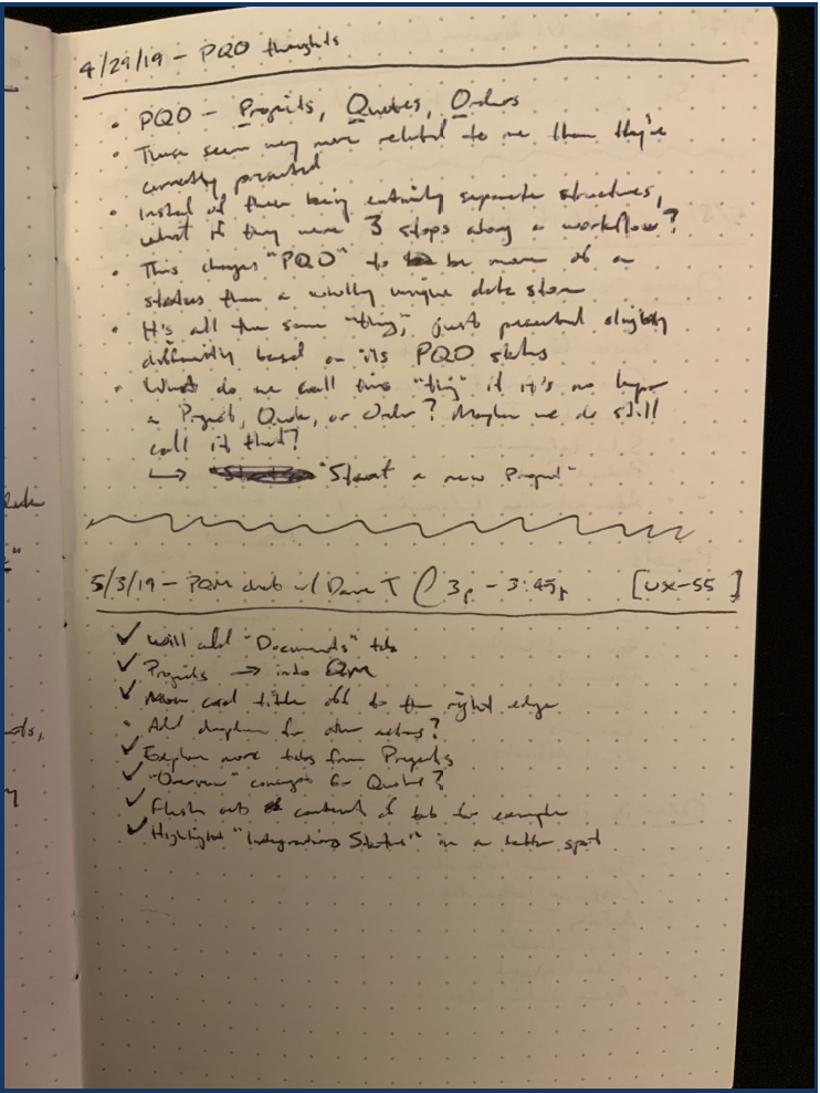
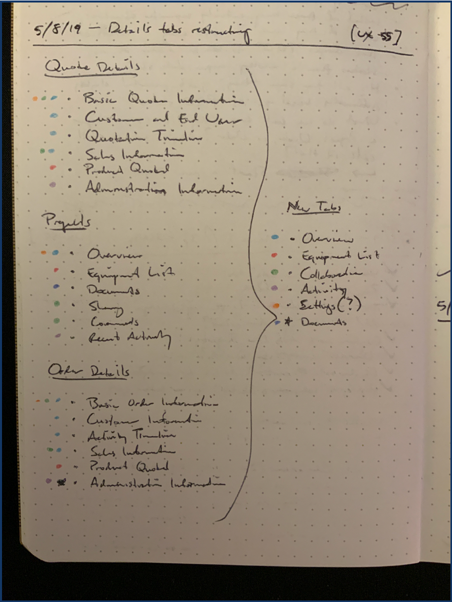
One challenge we identified as we started working on mockups was how to reconcile the current content differences between the two different Details views. The Quote Manager used an accordion-style UI to segment its content and allow the user to focus on only the sections they wanted to see. Project Portal, on the other hand, used a vertical tab approach. After polling various customer representatives around the office, it was decided that we would standardize on vertical tabs to maximize the available vertical screen real estate.
The next step was figuring out how to harmonize the tab labels. Quote Manager and Project Portal featured very different terminology for their sections, so it was a bit of a challenge. Project Portal won again, as users preferred its more approachable nomenclature. I then created a plan for restructuring the existing content to fit into a new set of tabs that could be used across Projects, Quotes, and Orders.
I now had a solid understanding of the relationship between our major content types, a strategy for harmonizing their inner content, and a plan for arranging the content on the screen. We decided we were ready to start building some mockups.
Figma mockups
I used Figma to create an initial set of mockups. I started by focusing on the appearance of the tabs themselves. We knew we wanted to keep Project Portal’s vertical tab style, but I was interested in exploring new ways to display the tab controls. Our software allows customers to upload a page background image; because the previous tab controls were directly on the background image, there were multiple cases where ensuring the readability of the tab labels was a struggle. I proposed three options—one that represented our current approach, and two that introduced a background panel for the tab controls so they would always be legible.
The final option performed the best when interviewing our customer representatives. The background panel behind the tab controls was a welcome addition, and its header element did a much better job of tying the title and global actions to the content.
I also mocked up some ideas for an activity log and the introduction of a Related Work concept. Project Portal and Quote Manager already featured their own crude activity logs, so I saw this as an opportunity to improve on our previous attempts now that it would play a much larger role.
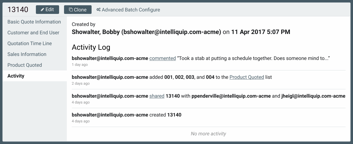
During my initial research, I discovered that we didn’t have a way to show a user how a particular Project might relate to its child Quotes or Orders. As was explained to me, Projects have Quotes, and Quotes have Orders. You could have any of those pieces that are independent of one another, but the chain of an Order based on a Quote based on a Project wasn’t exposed in any way to the user. Bringing all of this functionality into one codebase seemed like the perfect opportunity to introduce this quality of life improvement for our users.
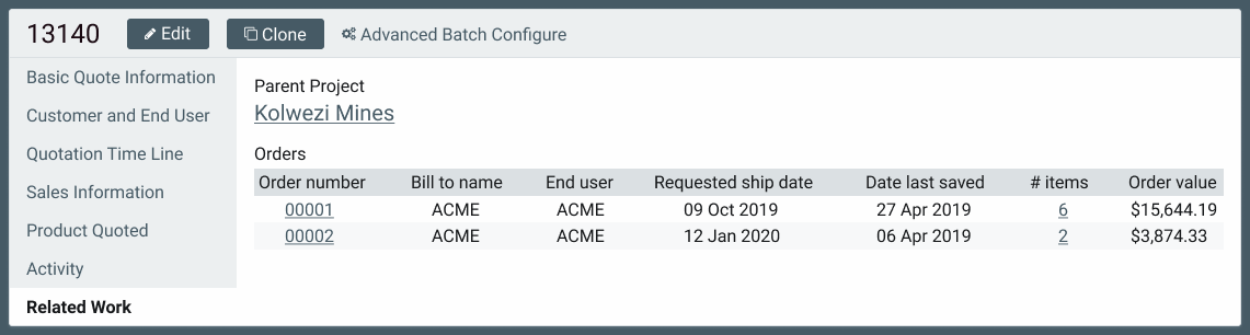
If in a Quote, for example, the Related Work tab would show the parent Project and any related Orders. Similar relationships would be shown as you moved up or down the hierarchy. Exposing these relationships added valuable information for the user, as they could now see the scope and impact of a particular piece of work, all without having to string things together on their own.
Onwards to Code(Pen)
The Figma mockups also contained the foundations for many of the UI elements we would need for the real Details view—tables, links, buttons, lists, headings, etc. After refining these mockups, we transitioned to CodePen so we could begin to explore implementation and working with more realistic content.
We use CodePen a lot. It’s a great tool for working in an isolated environment, allowing you to focus on your particular problem without the distractions of your normal implementation setup. I like getting into code (HTML & CSS) as soon as possible when working with mockups; it gives me a better feel for how various components will actually respond to a user or browser, exposes potential gaps in our initial planning that can be more readily patched with modifying code, and is more representative of the final functionality while still allowing for a wide range of visual or technical polish.
Ready for prime time
With the HTML and CSS finalized for the new application, it was time to roll everything into an implementation environment. I worked with my development team to integrate the front-end code into our new application, named Project / Quote Manager.
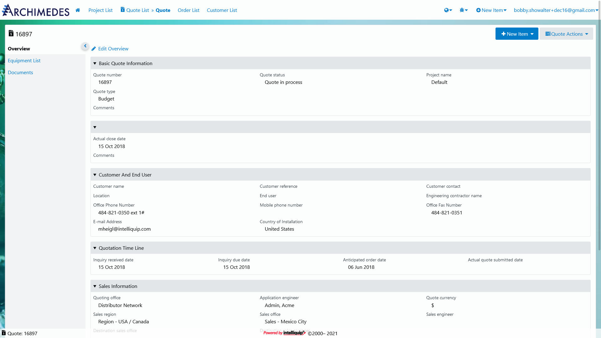
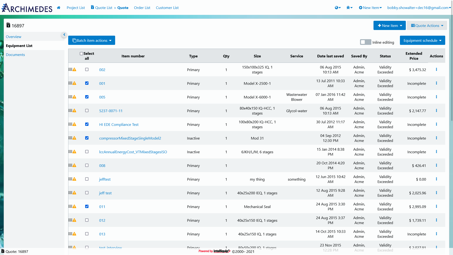
The new UI is aided by a “display density” setting, so users who demand a high degree of information density can still shrink whitespace down to their desired level. Our new Overview tab does a better job of visually coupling the key and value pairs of data. On the Equipment tab, we increased the visibility of advanced item-level actions by moving them to an always-visible Actions column. Previously these actions were only available behind a right-click menu.
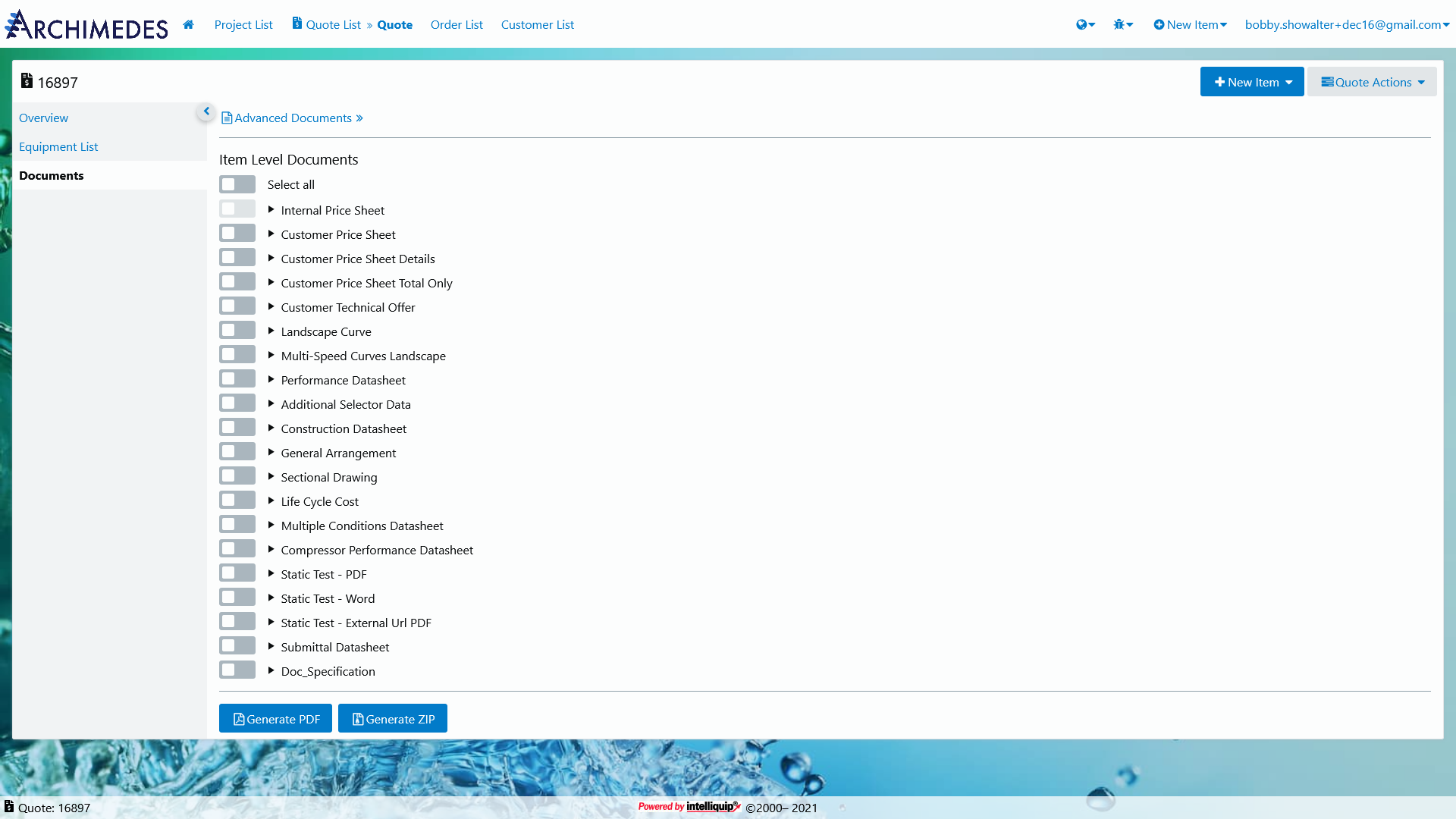
A primary objective when creating a Project, Quote, or Order is getting to the documentation associated with the relevant line items. The new Documents tab provides a more intuitive interface for accessing these documents. We are still working on a number of important updates, but we will soon be able to phase out the Advanced Documents link as we continue to deliver enhancements.
Finally, one of the most important parts of this redesign was the implemenation of a responsive layout powered by Flexbox and CSS Grid. Items now gracefully reflow and adapt for smaller screen sizes, whereas the older designs struggled to accommodate devices other than desktops.
Getting the redesign across the line was immensely satisfying. By working closely with my team and our customers, I was able to identify and build a number of improvements to address previous pain points. Consolidating the codebase and functionality will also increase our ability to respond to future change.