Striking the right balance between an information-rich UI and a more open design is always a challenge. At Revalize, our software serves the full range of “power” to “casual” users. Building a UI that can respond to a display density user preference is one way we’re working to accommodate people of all backgrounds.
In this post:
The end result
Before we get into the technical details of how we designed for display density, I’ll share some screen shots of the end result.
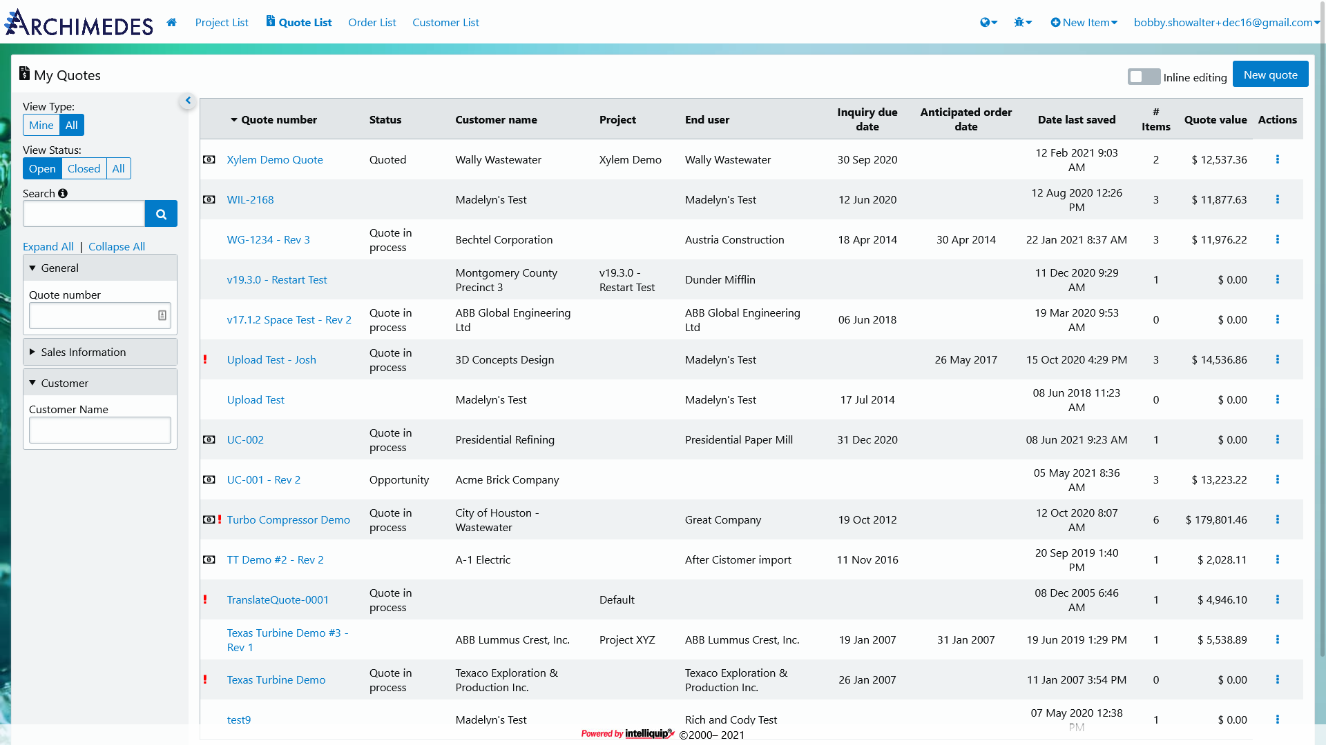
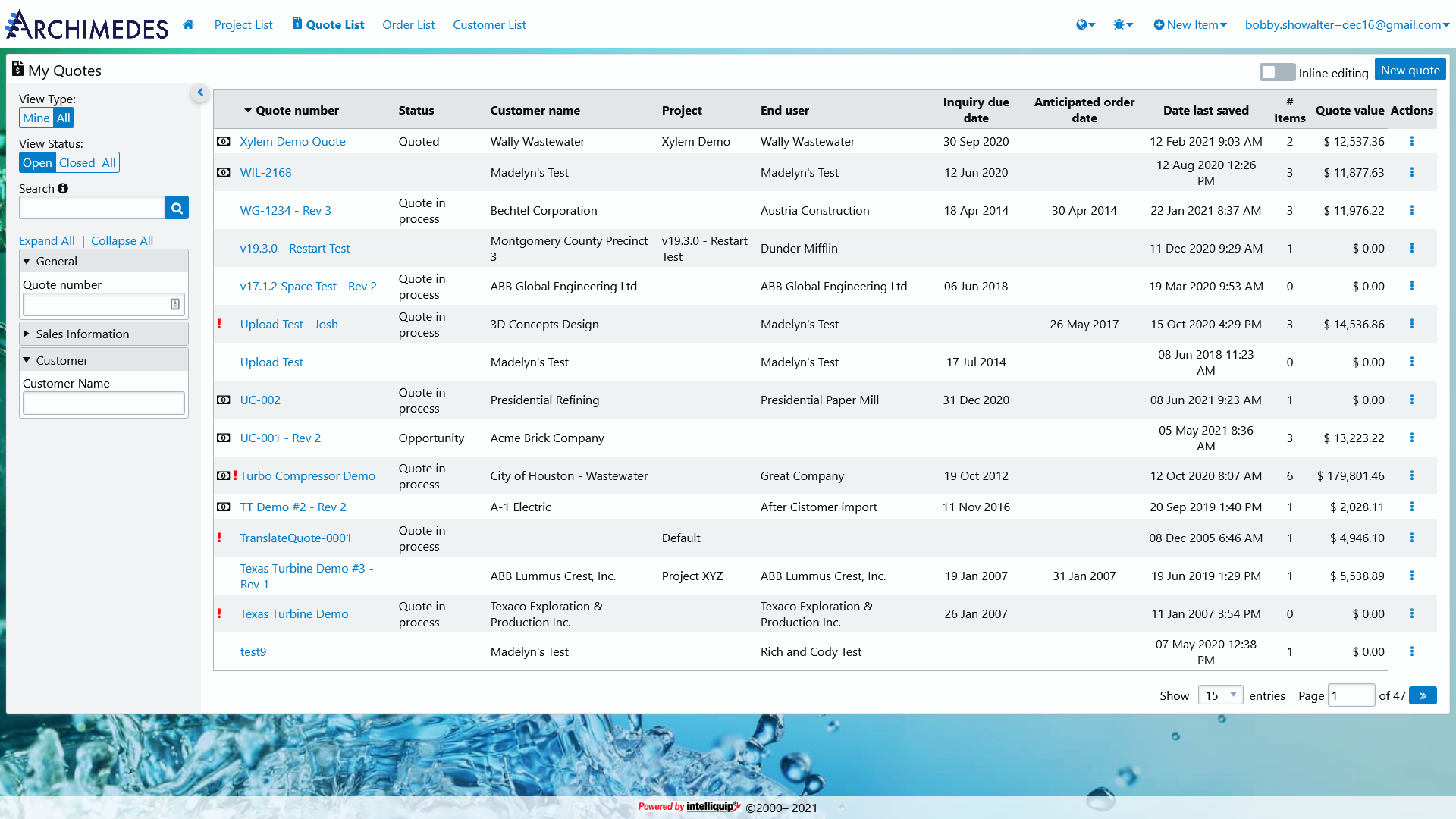
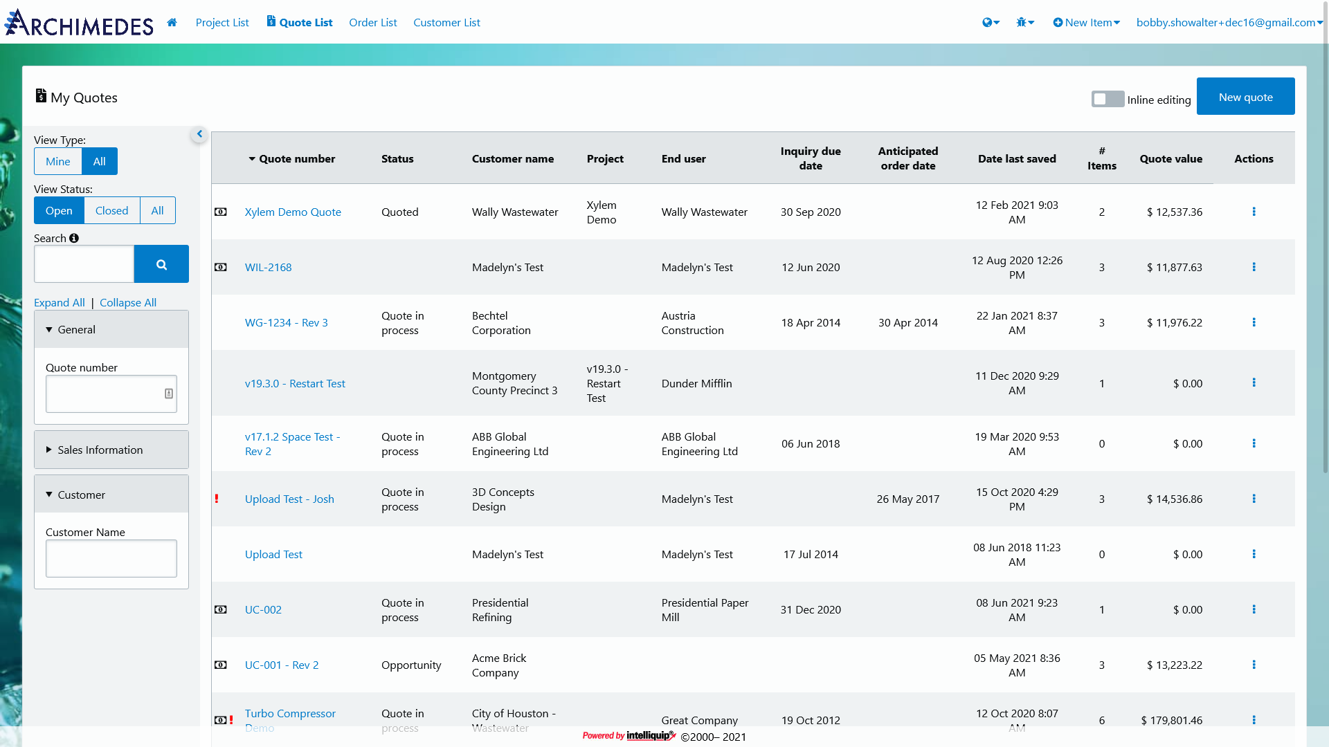
Users are able to alter the entire appearance of the UI with a simple toggle in their preferences. It’s been an absolute joy observing how different users have their UI configured. The compact setting is especially popular with those users who are transitioning over from some of our legacy applications.
Where to start
Adding display density support to our existing modern UI took careful planning. There are a number of different approaches we could have taken—ranging from the complexity of redesigning every component for every density preference, to the simplicity of adding a basic modifier to all existing sizing values. In the end, we settled on the simpler side of the spectrum. This allowed us to introduce this new concept to our users in a way that had minimal impact on the codebase, but would still provide immediate value for those who could most benefit from its use. As more advanced use cases pop-up in response to this real-world feature, we can use the existing framework to handle those changes.
The display density is configured as one of three choices: default, compact, or comfortable. Users don’t have the option to change things on a per-page or per-component basis; it’s all-or-nothing.
To make things as easy as possible in the codebase, we chose to design and develop from the “default” perspective. We build our components the way we intend for them to look at the standard display density, then use CSS to calculate the “compact” and “comfortable” spacing.
Basic set up
The display density scale is influenced by three modifiers, defined first as SCSS variables:
$ui-density-default– 1x density$ui-density-compact– 0.5x density$ui-density-comfortable– 2x density
Each Org is able to customize these values to achieve their desired look.
These variables are fed into corresponding CSS Custom Properties:
:root {
  --ui-density-default: #{$ui-density-default};
  --ui-density-compact: #{$ui-density-compact};
  --ui-density-comfortable: #{$ui-density-comfortable};
}
We then define a single CSS Custom Property to use when authoring styles. This
single property uses default as its initial value and fallback to ensure
things don’t break if the value becomes corrupted in some way.
:root {
  --ui-density: var(--ui-density-default, var(--ui-density-default));
}
Finally, we use data- attributes to handle the density preference change:
[data-ui-density="compact"] {
  --ui-density: var(--ui-density-compact);
}

[data-ui-density="comfortable"] {
  --ui-density: var(--ui-density-comfortable);
}
Today, the user’s display density preference is added to the html tag. We
don’t define a specific element for the CSS selector, however, so that we
preserve some flexibility in the way we use the display density preference.
There may be some instances where we only want part of a page to respond to this
setting; leaving the selector open-ended like this gives us that freedom.
Writing a density-ready style
To write a display density-ready style, the developer calls the --ui-density
custom property in a calc function, like so:
.my-class {
  padding: calc(.5em * var(--ui-density));
}
That padding value would then change based on the modifier value of
--ui-density.
Developer aids
Having the ability to fine-tune the density of the UI is all well and good on the user-side, but actually implementing these styles as a developer is another matter. Some developers won’t have an issue working with the custom property like in the previous example, but others might. I built multiple helper utilities to make it as straightforward as possible to design for display density.
SCSS Functions
Our first helper is the size() function in our SCSS library. This function
takes a scale degree, like '2', and returns the corresponding value from our
global $SIZES_MAP. Along with a unit, the developer can also pass $density:
true as an argument to return a size that is configured for the display density
preference.
// source
.some-selector {
  margin: size('2', $unit: 'rem', $density: true);
}

// compiled
.some-selector {
  margin: calc(1rem * var(--ui-density));
}
This size() function also provides some dogfood for our size-list() function
and space() mixin.
For a list of sizes, the size-list() function iterates through each value in
the Sass list, runs it through the size() function, and returns the full
result.
// source
$my-size-list: 'base' '2';

.some-selector {
  padding: size-list($my-size-list, $density: true);
}

// compiled
.some-selector {
  padding: calc(.5em * var(--ui-density)) calc(1em * var(--ui-density));
}
SCSS Mixin
The space() mixin makes writing margin-* and padding-* styles even easier than the previous examples.
// source
.my-selector {
  @include space(margin, horizontal, '3', $density: true);
  @include space(padding, all, 'base');
}

// compiled
.my-selector {
  margin-right: calc(1.5rem * var(--ui-density));
  margin-left: calc(1.5rem * var(--ui-density));
  padding: .5em;
}
This mixin outputs the appropriate property, using keywords from our
$DIRECTIONS_MAP, and applies values from our $SIZES_MAP with the density
preference, if desired. Internally, the space() mixin makes a call to the
size() function to grab the appropriate spacing value.
This was a fun feature to implement. As we continue to transition our power users off of the legacy applications they’re used to, building accommodations like this will be an important part of supporting their experience.